Case study 02 · Seattle STS
The quote email that doubled bookings
Seattle STS Town Car & Limo Service · 2026 · Designer, and the person who built and shipped it
A quote email has one job: turn a price into a booking. The old one hid the two things a passenger needed to do that. I redesigned it, built it with AI inside the company’s booking system, and shipped it in ten versions over five weeks. Quote-to-booking went from 29% to 61%.
- Client
- Seattle STS Town Car & Limo Service — chauffeured cars, SUVs and vans; a luxury Uber, booked ahead
- My role
- UX design, build, and shipping. I also dispatch for STS, so I answered the phone before and after.
- Built with
- Codex, inside Limo Anywhere’s email-template system. No Figma.
- Timeline
- Ten versions, 24 June – end of July 2026. Measured 1 August – 15 September.
- Result
- Quote-to-booking 28.8% → 61.0%. Bookings per day 2.8 → 5.4, from slightly fewer quotes.
Where the quote fits
Nearly every new STS customer starts the same way: they ask for a price. Dispatch works out the rate in Limo Anywhere, picks an email template, and sends the quote. Everything after that — whether the passenger books, replies, phones, or disappears — depends on that one email.
For years it was the software’s default template, and it looked like it.
What was wrong with it
Not “outdated”. Two specific things, both of which I could hear happening on the phone.
1. Nobody could work out how to book.
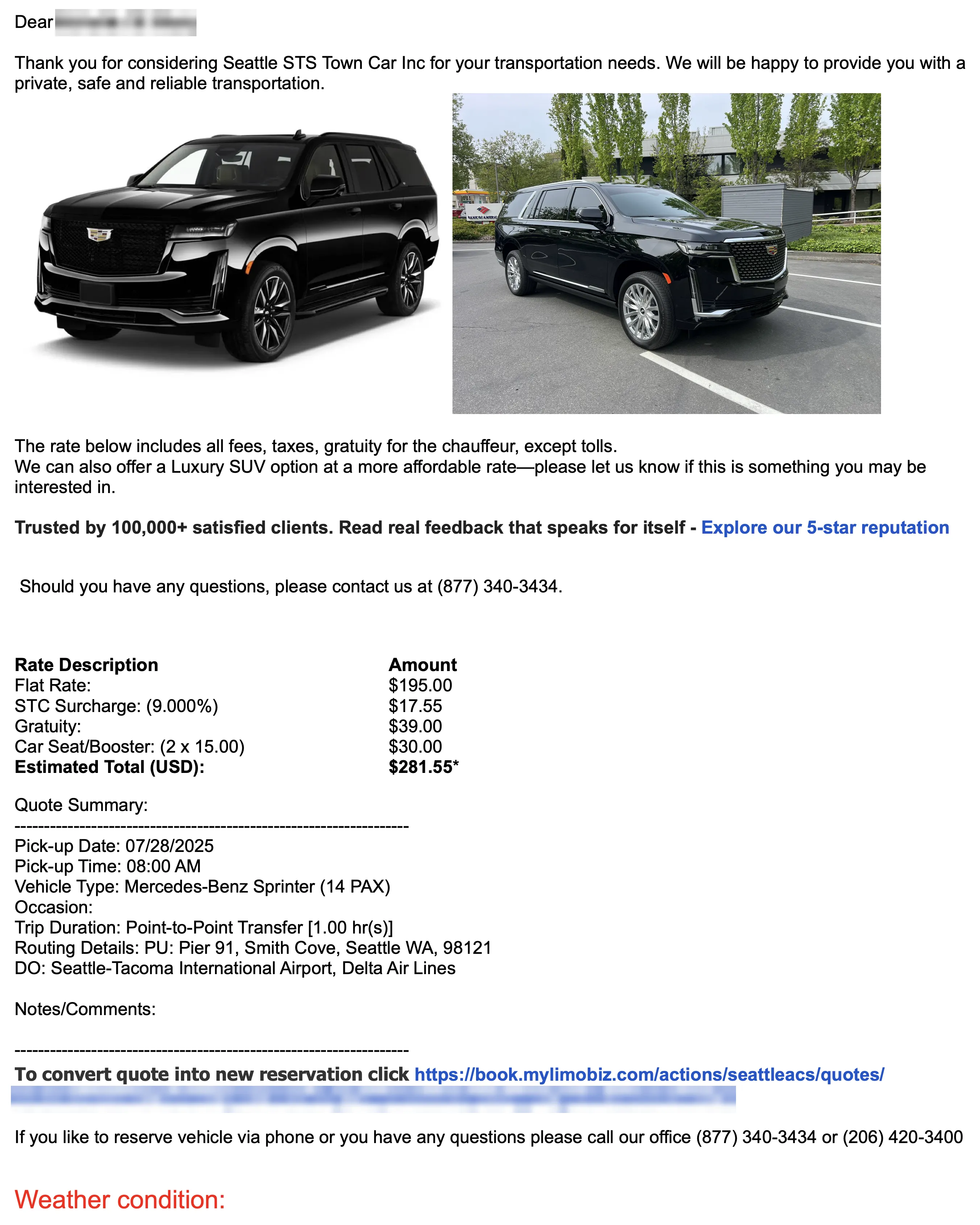
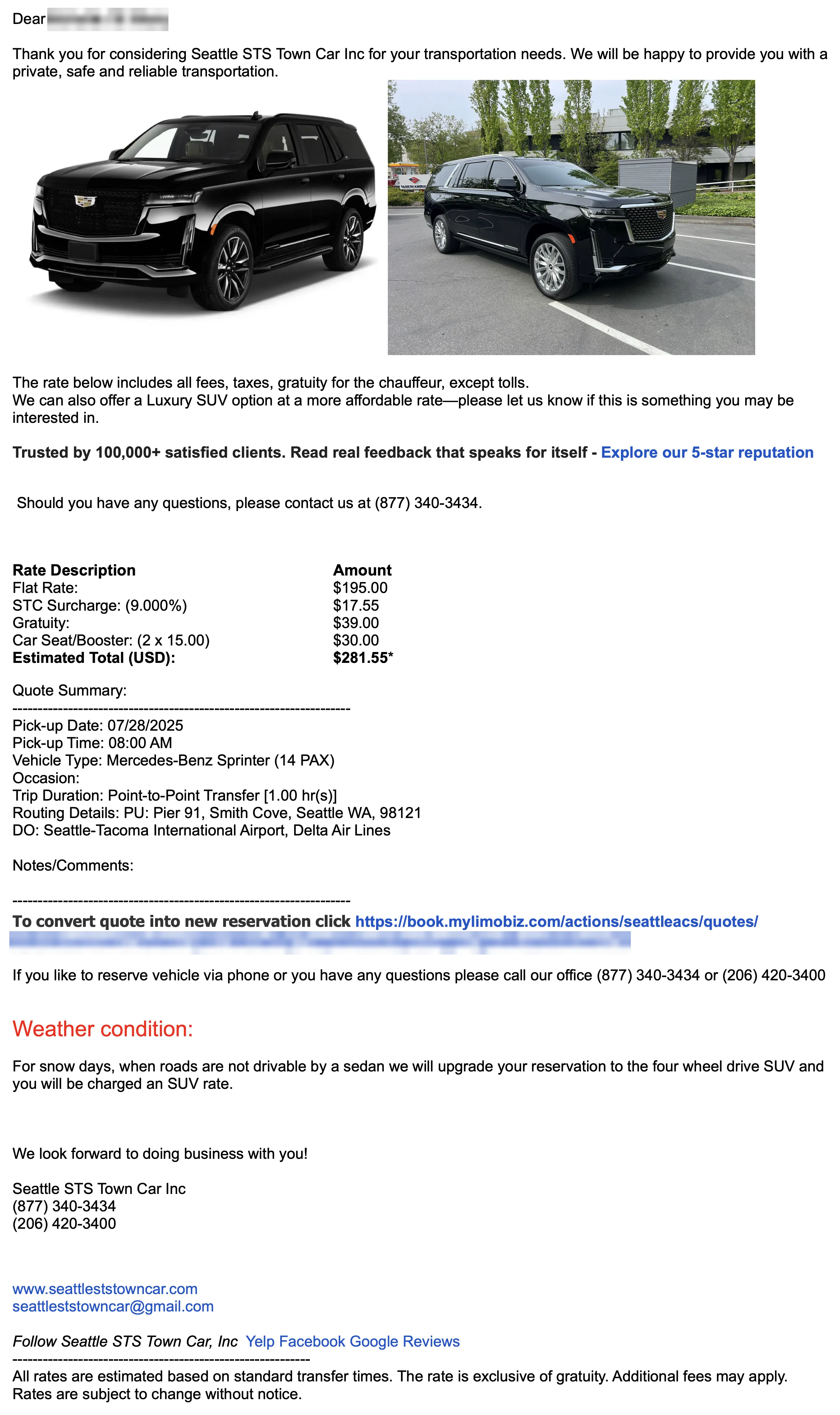
The only way to convert the quote was a link — a 110-character tokenised URL, in body text, below the price summary. Not a button, too long to read, too small to tap. So passengers emailed to ask how to confirm, or phoned, and dispatch converted the quote for them by hand and took the card number over the phone.

2. The cheaper option was invisible — and it was the option people wanted.
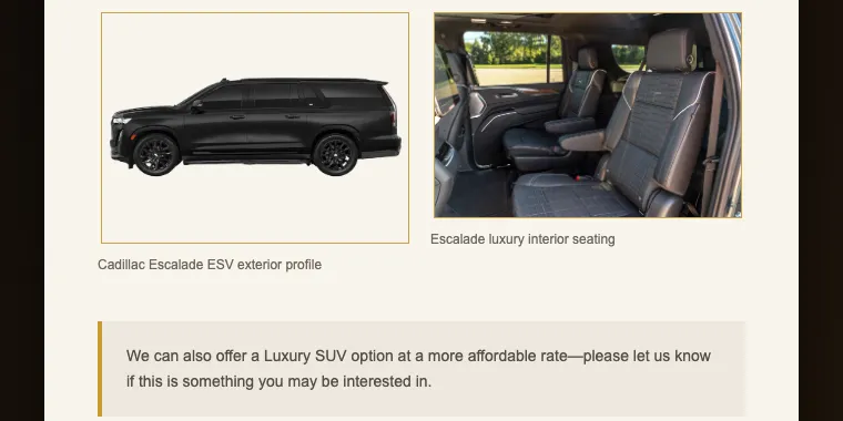
On Cadillac Escalade quotes, roughly half the replies were the same question: “do you have something more affordable?” We did — the Luxury SUV, a Suburban — and those passengers booked once they heard the rate. The old email mentioned the alternative in one highlighted sentence of body copy that nobody read.

There were other faults — a trust line nobody could verify, stock photos of the wrong trim, a rate breakdown that was a text dump — and the redesign fixed those too. But the two above are the ones that cost bookings.
Shipping in versions
I didn’t get either fix right the first time. That’s the part worth reading.
Problem 1 took three tries
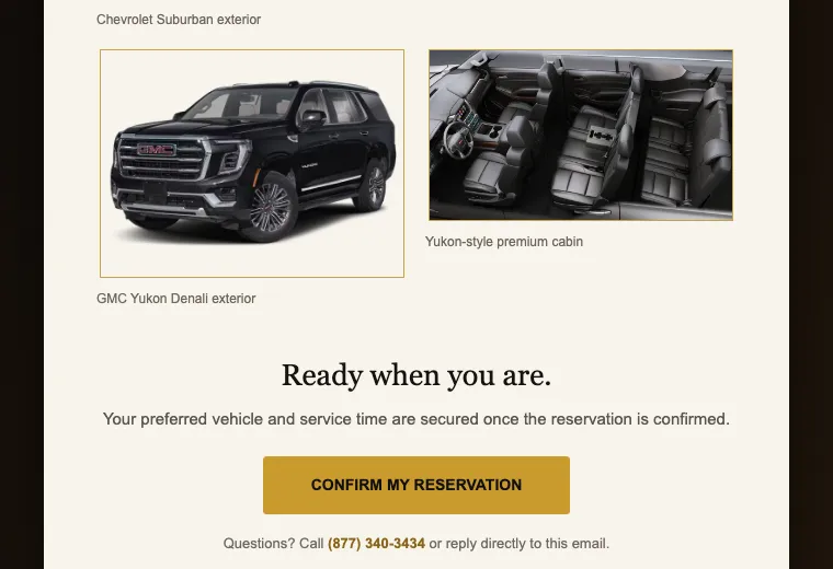
v3 — the first version customers received. A real “Confirm my reservation” button instead of the link. It went at the bottom, below the vehicle photos, where a sign-off would go. Fewer “how do I book?” calls than before. Still some.
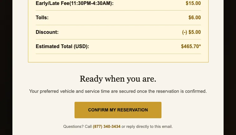
v7 — the button moves up. Directly under the rate, before the photos. The reasoning was sound: put the action next to the price. Still some calls. People scrolled past a small gold button on a cream page.
v9 — the button becomes a band. Same position, but now a full-width dark section: “Next step: reserve your trip”, a sentence explaining that the booking isn’t secured until it’s done, and the button. Confusion about how to book more or less stopped.
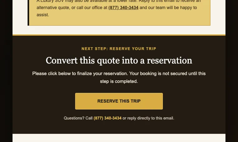
Position wasn’t enough. Contrast was the fix.
Problem 2 took two
v9 — a proper block for the cheaper option. “Looking for a more affordable option?” with its own heading and a gold panel, so it couldn’t be missed. I put it below the vehicle photos, after the reserve band.
It did worse than the old highlighted sentence. Fewer people asked about the SUV than before.
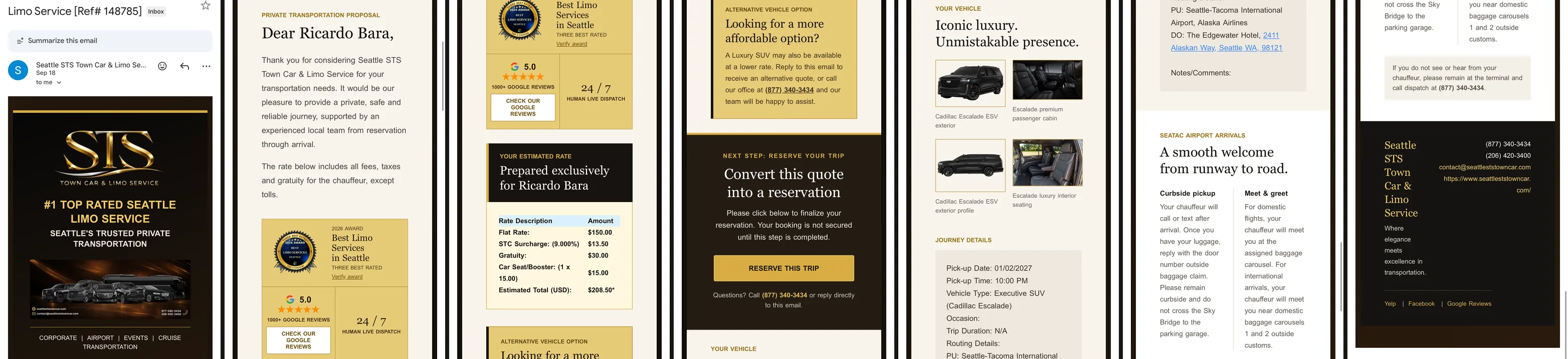
v10 — the block moves under the price. Between the rate card and the reserve band, where the passenger is deciding. SUV enquiries came back.
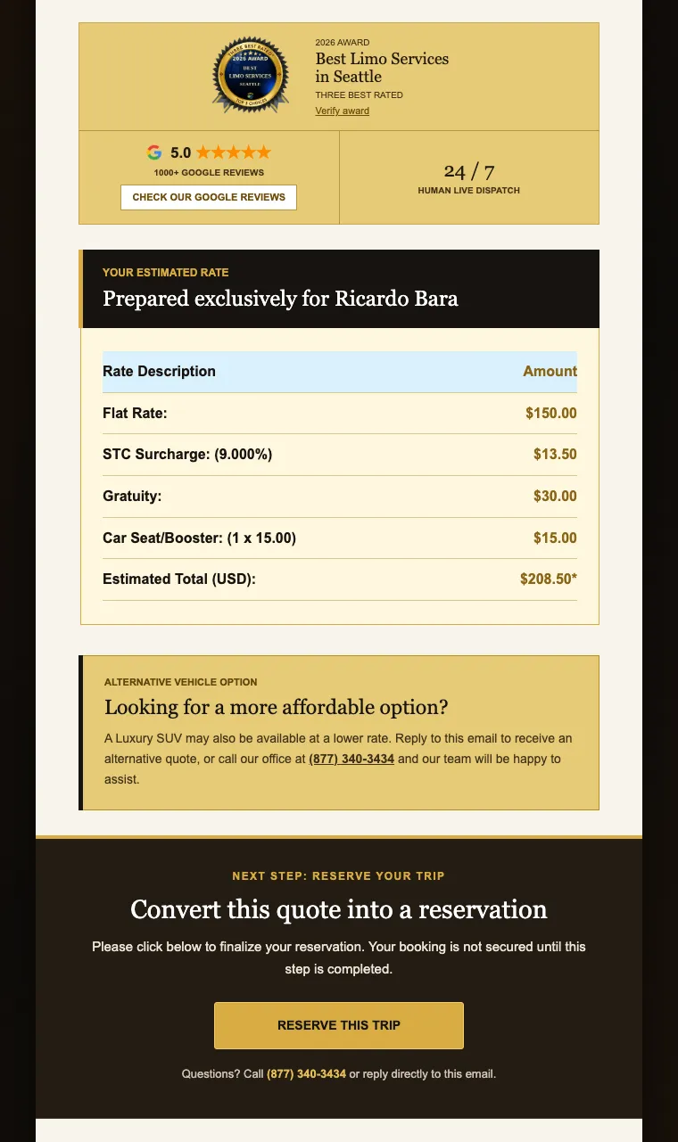
Same lesson twice. The email is read top-down, once. Anything meant to influence the decision has to sit between the price and the button. Below the photos, it might as well not exist.
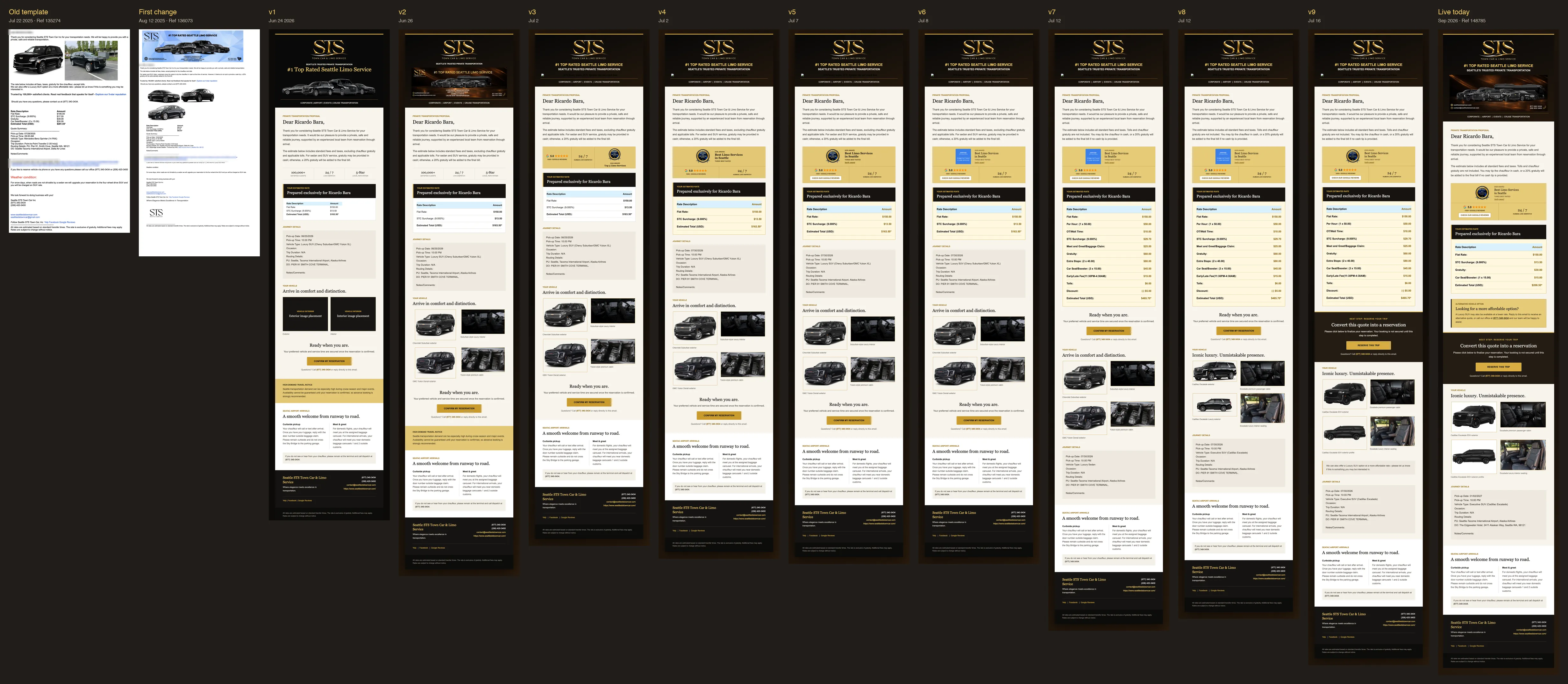
All twelve versions, and why each one changed
| Version | Sent | What changed | Why | What happened after |
|---|---|---|---|---|
| v0 · Ref# 135274 | 22 Jul 2025 | Default Limo Anywhere template: plain text, dashed rules, bare tokenised URL as the only way to book, Luxury SUV as highlighted body text | — | Many “how do I book?” emails and calls; about half of Escalade quotes bounce back asking for cheaper |
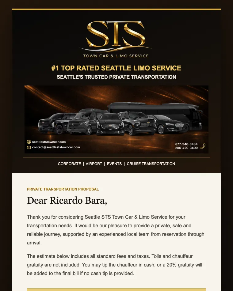
| v0.5 · Ref# 136073 | 12 Aug 2025 | Blue hero banner, gratuity line fixed, three matching vehicle photos | First attempt to make it look like STS | Still a bare URL — same confusion |
| v1 | 24 Jun 2026 | First redesign: black, gold and white, rate card, journey panel, “Confirm my reservation” button at the bottom | Problem 1, and the look | Test send — placeholder photo boxes |
| v2 | 26 Jun | Placeholder boxes become real Suburban and Yukon photos; mobile CSS | Photos | Test send |
| v3 | 2 Jul | “100,000+ / 24/7 / 5-Star” strip replaced by Google 5.0 and the ThreeBestRated award | Trust had to be verifiable, not asserted | First version customers received. Fewer “how do I book?” contacts than the old template, still some |
| v4 | 2 Jul | Award gets its own row; rate box tinted gold | The price wasn’t standing out | |
| v5 | 7 Jul | “Verify award” and “Check our Google reviews” links | Trust claims become clickable | |
| v6 | 8 Jul | No visible change | Image hosting issues | |
| v7 | 12 Jul | Button moved from below the photos to directly under the rate; full 11-line rate breakdown | Problem 1 — customers still not finding the button at the bottom | Still some “how do I book?” contacts |
| v8 | 12 Jul | Escalade replaces the Suburban and Yukon | Escalade is the quote type that bounces | Rate box untinted, no cheaper-SUV mention — problem 2 exposed |
| v9 | 16 Jul | Dark “Reserve this trip” band and a “more affordable option” Luxury SUV block, below the photos | Problem 1 (contrast, not just position) and problem 2 | Booking confusion nearly gone — but fewer SUV enquiries than the old highlighted sentence |
| v10 · Ref# 148785 | by end of Jul | Affordable block moved directly under the rate, before the reserve band; hero image on reliable hosting; rolled out to every vehicle type with its own photos | Problem 2 again | SUV enquiries back; 28.8% → 61.0% over 1 Aug – 15 Sep |
The result
Over 47 days on the old quote email (15 May – 30 June 2026), 455 quotes produced 131 reservations — a 29% quote-to-booking rate. Over the following 46 days on the redesigned email (1 August – 15 September), 408 quotes produced 249 reservations — 61%, more than double, with almost twice the bookings per day from slightly fewer quotes.
| Measure | Old email | New email |
|---|---|---|
| Window | 15 May – 30 Jun 2026 · 47 days | 1 Aug – 15 Sep 2026 · 46 days |
| Quotes sent | 455 | 408 |
| Became reservations | 131 | 249 |
| Quote → booking | 28.8% | 61.0% |
| Bookings per day | 2.8 | 5.4 |
The windows fall in different parts of the summer season, and the newer one has had less time for late bookings to land, which if anything understates the gap. Nothing else about pricing, fleet or operation changed between them; I didn’t have advertising data to check. I started the count on 1 August rather than launch day so the whole window sits on the final version.
I dispatch for STS as well as design for it, so I felt the change directly. A quote is a price and a couple of clicks now. Before, those clicks were followed by emails to answer, calls to pick up, and customers who couldn’t find the link — so we converted the quote by hand and took the card over the phone. Now it’s all electronic. The questions we still get are about policy, wait time and grace periods. Not price, and not how to book.
How it was built
I design; I don’t write HTML. I’d wanted to redesign this email since 2023, and the tools couldn’t do it then — I have the failed attempts. In 2026 they could.
The constraint is Limo Anywhere’s template system. A template is HTML around #TAGS# — #PRICE_QUOTE#, #QUOTE_SUMMARY#, #CONVERT_URL# — that the system fills at send time. You control everything around the tags and nothing inside them. The rate table and the journey block are system output; I styled them from outside rather than touching markup I didn’t own.
So the first version was a test of one thing: could the AI produce a template where every tag got filled? It came back with placeholder boxes where the photos would go and nothing else. That was the point. I sent the first real reference to the owner, he said go, and from there Codex was the canvas and the coding machine in one. Each version came back rendered; I commented on what was wrong, sent references, and explained the fix from a UX standpoint — in words, not in Figma. The chat is the changelog.
The slow part was the photos: black exterior, black interior, the exact models in the fleet, as PNG, on hosting that would load in an email client. One version shipped with a fleet image hosted on Google Maps. It rendered in Gmail and nowhere else. That’s how I learned the hosting requirement.
The old header carried the phone numbers, the website and the four service lines. The new body already said all of that, so the header became the logo and the fleet. Removing was most of the work.
What’s next
The current version still gets a few things wrong, and I know what the next one is.
- The responsive layout doesn’t fire in Gmail. The template’s media queries are stripped because the system inserts it into the message body. On a phone, the two-column sections stay two columns — legible, but cramped. A fluid-hybrid layout needs no media queries and would fix it.
- The cheaper option still says “reply to this email.” Limo Anywhere gives one reserve link per quote, so the SUV can’t have its own button. The next step is putting the SUV rate in the block so the passenger can decide without the round trip.
- A line on policy, wait time and grace period. That’s what people phone about now.
- Three contrast values and the small links. The accessibility pass found the orange stars and the gold labels a shade too light, and the secondary links under the 24px tap-target minimum. One hex value each.
I tried the trip-confirmation email next. The PDF attachments that travel with it made it more complicated than it was worth, and the quote was the change that mattered. I left it.