Case study 01 · Morikami Japanese Gardens
A garden ticket anyone can book
Morikami Museum and Japanese Gardens, Delray Beach · 2026 · A self-initiated concept
Morikami doesn’t sell admission tickets online. I designed the flow it could have: timed entry that never rushes anyone, and an accessible mode that’s a second, calmer way through — not a settings page.
- Client
- Morikami Museum and Japanese Gardens, Delray Beach, Florida. A real museum, an imaginary project — nobody commissioned it.
- My role
- Everything: research, UX, UI, the design system and the prototype.
- Built with
- Figma — a design system of 23 components, 22 icons and 174 variables — and a hand-built HTML prototype.
- Timeline
- August – September 2026.
- Status
- Concept. There’s no live number; what I’d test is at the end.
What’s there today
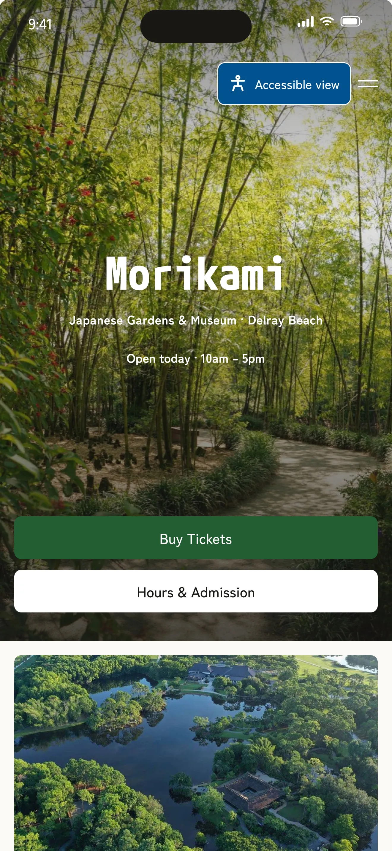
Morikami is a Japanese garden and museum in Delray Beach: six gardens laid out around a pond, two galleries, a bonsai collection. Its website can’t sell you an admission ticket. You find the price, drive there, and pay at the desk.
I went through the site the way a visitor would and wrote down what got in the way. No way to buy admission online. A “Plan your visit” link on the homepage that leads to a missing page. A header whose only button is Donate. What I found on morikami.org has the rest.
The access information is thorough — push-button entry, the path surface, benches, ramp access — but it sits halfway down the Hours & Admission page, and it says plainly that wheelchairs aren’t provided.
Timed entry that doesn’t rush anyone
A garden has quiet mornings and crowded afternoons. Timed entry tells the museum how many people are coming, and when. It usually does that by putting a clock on the visitor.
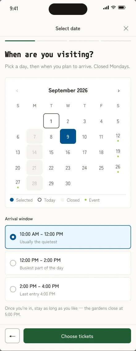
I split the day into three two-hour arrival windows: 10 to 12, 12 to 2, 2 to 4. The window is only about arriving. Once you’re in, you stay until close, and the screen says so.
No countdowns. The first version showed “8 spots left”. I took it out: the museum isn’t busy enough for that to be true, and invented scarcity is pressure to buy. Each window says what’s usually true instead — “Usually the quietest”, “Busiest part of the day”.
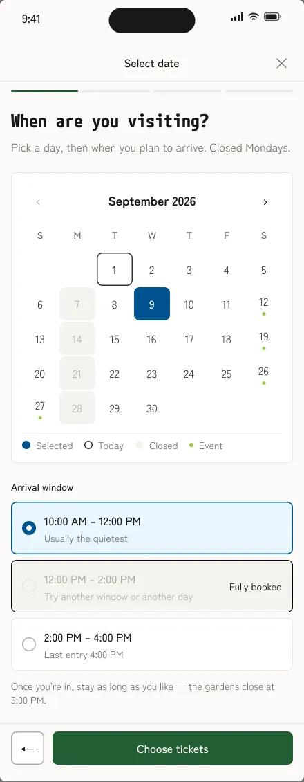
No late-arrival error. A full window says so softly and points to the others. If you turn up late, the front desk finds you the next window. That’s a conversation for a person, not a screen.
Accessibility, as the centrepiece
This is the part I’d hire myself for. The real museum is wheelchair accessible but doesn’t lend wheelchairs. Because this is a concept, I designed what a garden could plausibly offer, and wrote it the way someone with a need would want to read it.
Inside the normal flow
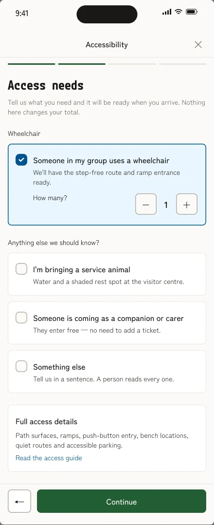
Access needs get a step of their own, between tickets and review, called “Accessibility” — the word people scan for, not a softer label nobody finds. A wheelchair, with how many. A service animal. A companion or carer. Something else, in a sentence — “A person reads every one.”
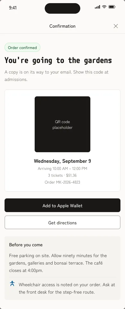
Three rules held it together: real quantities, no demand for proof, and nothing on the screen changes your total. The wheelchair then follows the booking: “No charge” on the review, a note on the confirmation to ask for the step-free route.
A second way through
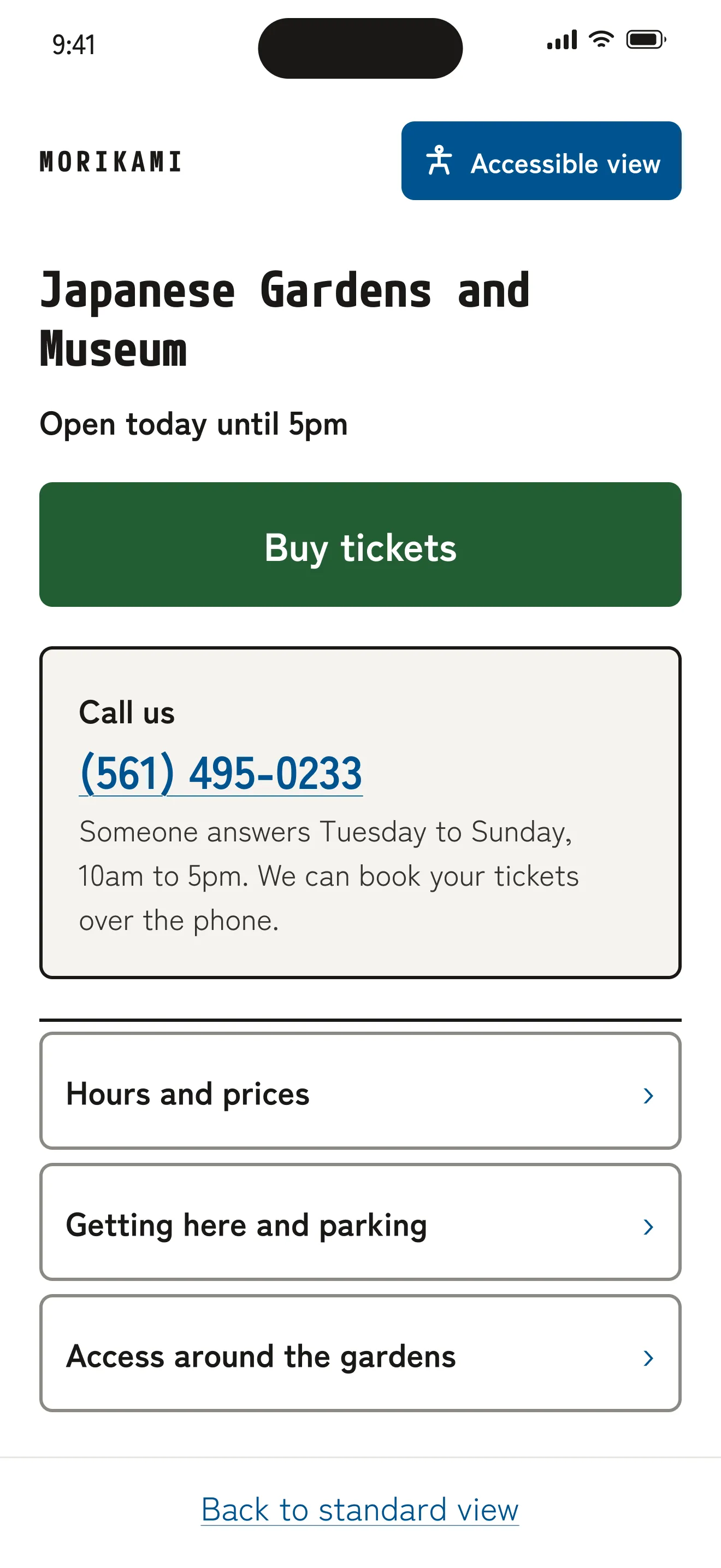
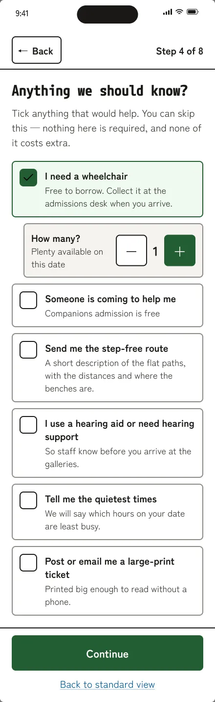
Some visitors don’t want a calendar grid, a stepper and a 15-minute timer. Accessible mode is a separate flow, one tap from the first screen, in eight plain steps: When are you coming? How many people? Anything we should know? Check this is right.
It’s built differently, not just bigger: 30px headings, 2px borders, tap targets of 56 to 80 pixels, one question per screen, “Step 4 of 8” at the top, and a colour mode that fixes the two values the standard palette fails. It keeps what you’ve picked, so switching modes doesn’t start you over.
And it takes the pressure off. No time limit. Reserve now, pay at the desk. A code short enough to read out. A phone number where it matters, with someone behind it.
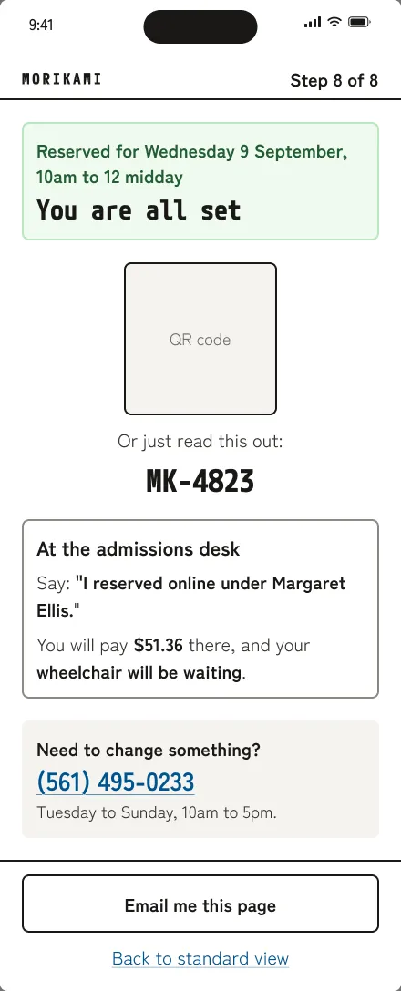
The copy follows one rule: labels stay plain and findable, and the warmth goes where the worry is — the arrival window, whether a request reaches a person, what happens at the desk.
How it was built
Research first, then a design system in Figma, then the screens. The system has two colour modes: the standard palette, and an AA mode that fixes the two values it fails. The accessible screens use the AA mode.
The prototype is hand-built HTML with real behaviour, not linked pictures. The calendar knows Mondays are closed and that the last Saturday of each month sells out. Ticket counts add 7% tax. A card starting with 4000 declines. The standard flow holds your tickets for 15 minutes and times out for real — accessible mode switches the timer off.
I tested it once, with friends and family and one task: try to buy a ticket. Everyone got through, and everyone liked it. That’s encouraging, not evidence — a friendly room, nobody briefed as a member, and an older typeface than the one on these screens.
To reach the states that are hard to hit by chance — a declined card, a timed-out session, accessible mode — use the Screens button in the corner, or press ?.
What I’d test, and what’s not done
Nothing shipped, so there’s no number. If it did, I’d want to know three things:
- Can someone using a screen reader book start to finish in accessible mode, on their own?
- Do the windows actually spread arrivals out, or does everyone still come at noon?
- Do access requests reach the front desk in a form staff can act on?
And what’s still open:
- Two colours fail contrast in the standard palette — the input borders and the dot that marks an event day. Accessible mode fixes both; the standard mode should too.
- Type is set in pixels, so it scales with zoom but not with a visitor’s default text size.
- Member sign-in, promo codes and wallet payments are entry points, not finished flows.